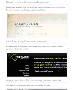
This rhetorical analysis of a JavaScript web site initially began with the wiki page created by the JavaScript team in our class. However, when I looked at their examples and found that I couldn’t even look at any of the Chrome Experiments without Google Chrome on my computer, I wondered what the point was of creating “experiments” not all browsers could appreciate. I then decided to Google the words “Javascript websites.” Up came a very encouraging result entitled, 50 Sites that Make Amazing Use of JavaScript.
What I found somewhat disappointing is that the majority of the fifty sites, as beautiful as they were, were created for designers, marketers or developers. The reason I felt disappointment is it would appear that the bells and whistles of JavaScript seems to be only possible by people who really know graphic design, marketing and/or programming. That may be an assumption, but if JavaScript were more intuitive and easy to work with, wouldn’t more people be using it to these “amazing” ends?
My personal goal for this analysis was more humble than that. I wanted to find a web site that employed JavaScript for simpler features instead of the amazing ones.
Of course, one way to complete such a rhetorical analysis is to consider traditional rhetorical processes regarding the intended audience, the structure of argumentation, supportive reasoning, evidence of persuasion and the way in which the author appeals to the audience’s values, emotions, etc. That is a standard approach toward rhetorical analysis. However, I had found another analytical model which I’ve used in other courses which includes these ideas, but rearranges them. The model comes from Deborah Cameron’s book, Working with Spoken Discourse, and I do not see why her approach could not apply to new media and even the code on a webpage. The following paragraph and acronym description comes from a paper I wrote which employed her method to a different context:
Cameron’s model notates and categorizes speech-related communicative activities for the purpose of creating an ethnographic portrait surrounding these activities. To this end, Cameron breaks a communicative event into three classifications—speech situations (the purposes for the speech activities) (55), speech events (smaller units of a situation) and speech acts (the smallest units, each having a specific task it is trying to achieve) (55). Next, Cameron offers a matrix of classifying field information using the acronym S-P-E-A-K-I-N-G (56):
• S—Setting, where the speech event is held in time and space;
• P—Participants, speaker(s), audience(s), “eavesdropper(s);â€
• E—Ends, the purpose for the speech events;
• A—Act Sequence, what speech acts make up the speech events and how they are ordered;
• K—Key, tone or manner of the speech event,
• I—Instrumentalities, channels, technologies, tools, languages selected from participant repertoires;
• N—Norms of Interaction, the rules that one needs to know to communicate in an appropriate way, and
• G—Genres, what pre-existing forms of communication informs this speech event. (Cooke)
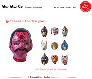
As you can see, Cameron’s acronym includes concepts from all of the canons of the rhetorical process. Therefore, this paper will apply her framework to a website for an edgy housewares shop in London by the name of Mar Mar Co. I personally know the man who owns this shop, and not surprisingly, he is also a graphic designer. However, his style is very simple and he has always leaned toward clean lines in his design sensibility. Because of its simplicity, I decided to use his website for this rhetorical analysis which uses JavaScript in less assertive ways than on the 50 Sites that Make Amazing Use of JavaScript.
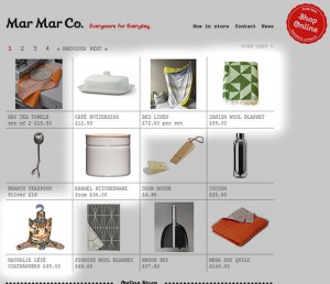
One of the pages of items for sale. Highlighted areas show how images change to show alternative sizes and colors.
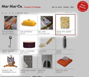
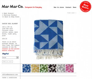
This image is the same page with some images swapped. When an images is selected (for instance the Danish Wool Blanket, highlighted with the red box ), the page changes to detailed information.
Classification of Info on Mar Mar Co web site
| Setting | This is a website that is freely open to the global, internet-surfing public. |
| Participants | Although anyone could potentially find this website if they knew the URL, the intended audience consists of anyone who would like to own trendy furnishings for their home, most likely in Europe, although not necessarily. |
| Ends | The goal of the website is to sell the products that are carried in the Mar Mar Co. store. |
| Act Sequence | As the target audience is mainly from Europe, and the potential for non-English speaking customers is high, the amount of written text is very small. Pictures create the main impact of the item being sold. There are no lengthy, poetic or inflated descriptions of the item, just basic information. |
| Key | The overall feel of the website is minimalist, two-dimensional, simple, with a lot of open space. |
| Instrumentalities | The items this website is selling are arranged in a table with no more than twelve items visible per page. When the user clicks on the image or the basic description of the item, the user is brought to another page which shows a larger picture of the item along with a more-detailed, logistical description of it, such as size, color, country it was imported from, price.
When one examines the coding of the webpage, one can see that JavaScript is employed to create a dissolved transition onto their website and once the user clicks to the pages where items are for sale, JavaScript swaps the images if the item comes in more than one color/style, etc. There are no audio nor video components to this webpage. The font choice of the item information resembles a simple typewriter (New Courier) font. The Logo and slogan font (Mar Mar Co, Everyware for Everydayâ€) uses a less common font, so the areas on the page where it is used are actually images. This allows the font to be viewed on all computers, whether the custom font is installed on the computer or not. Once an item is selected, they can add it to a cart and pay for it with Paypal. |
| Norms of Interaction | The code is as straight forward as the design of the webpage, as there are not many “//comments†in it outside of a few that merely explain points where the functionality changes and sometimes what the code is doing, for instance, “//transition duration (milliseconds).†Website navigation is spare and the user can browse to only three other pages from the main webpage: “Now in store,†“Contact†and “News.†When the user clicks on “News,†it goes to a blog site that announces new items each month. Again, the design of the “News†blog is done with the same minimal style, with several, carefully arranged images followed by a small, brief descriptive paragraph. |
| Genres | The pre-existing forms of communication this website is informed by are catalogs, magazine advertisements and to some extent, art galleries. |
I think the use of JavaScript to make a smooth, dissolved transition to their website as well as to swap out of images on each page indicates a very intentional design sense: The developers of this website could have made it more flashy, but have chosen to keep it simple and let the items speak for themselves.
Works Cited
Cameron, D. (2001). “Situations and Events: The Ethnography of Speaking.” Working with Spoken Discourse. London: Sage. 53-67.
Cooke, D. (2011). ‘Mornington Crescent’ and the Guise of Gameplay: An Ethnographic Analysis.Unpublished class paper for ENGL 805. 2011.

